به مناسبت ولنتاین، برای همه علاقمندان هنر و فن یک قطعه کد بانمک براتون تدارک دیدم که بسیار زیبا و دل نشین است می تونید در وبسایتتون بسازید و برای هر کسی که می خواهید آن را تقدیم کنید.
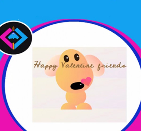
خروجی این کد را باهم در قسمت زیر می بینیم که با keyframe@ها چطور می توانیم تحرک و خوشحالی را در دل کد به نمایش در بیاریم.
خروجی این برنامه به شکل زیر به شما نمایش داده خواهد شد:
ساختار و html
<h1>Happy Valentine friends</h1>
<div id="puppy">
  <div id="face">
    <div id="left-eye">
      <div class="pupil"></div>
    </div>
    <div id="right-eye">
      <div class="pupil"></div>
    </div>
    <div id="nose">
      <div class="nose-twinkle"></div>
    </div>
    <div id="heart"></div>
  </div>
  <div id="left-ear"></div>
  <div id="right-ear"></div>
  <div id="upper-body">  </div>
  <div id="lower-body">  </div>
  <div id="left-leg">  </div>
  <div id="right-leg">  </div>
</div>
استایل یا css
برای استایل دادن به کد های پروژه از کدهای زیر استفاده می کنیم:
body {
  background-image: linear-gradient(-20deg, #e9defa 0%, #fbfcdb 100%);
}

h1 {
  font-family: 'Cedarville Cursive', cursive;
  text-align:center;
  font-size: 10px;
  margin-right: 197px;
  margin-top: 69px;
  animation: move 5s infinite;
 }
@keyframes move {
	0%{color:#f9bf72 }
	20%{color:#f9bf72 }
	50% {font-size: 52px;padding-lefT:40px; }
}
#puppy {
  position: absolute;
  left: 40%;
  top: -40px;
  right: 80%;
  width: 400px;
  height: 400px;
  z-index: -1
}
#left-eye,
#right-eye {
  z-index: 40;
  width: 18%;
  top: 40px;
  position: relative;
  right: -100px;
  height: 20%;
  -webkit-transform: rotate(10deg);
  -moz-border-radius: 100px / 50px;
  -webkit-border-radius: 100px / 50px;
  border-radius: 180px / 260px;
  background: #2b1d0e;
}
#right-eye {
  top: -20px;
  position: relative;
  left: 40px;
}

#right-ear,
#left-ear {
  z-index: -10;
  position: relative;
  top: -160px;
  left: -80px;
  width: 25%;
  height: 40%;
  -webkit-transform: rotate(38deg);
  -moz-border-radius: 100px / 50px;
  -webkit-border-radius: 100px / 50px;
  border-radius: 180px / 260px;
  background-image: linear-gradient(to right, #ffecd2 0%, #fcb69f 100%);
}

#right-ear {
  -webkit-transform: rotate(-38deg);
  top: -320px;
  left: 140px;
}

#nose {
  z-index: -10;
  position: relative;
  top: 110px;
  left: 30px;
  width: 30%;
  height: 34%;
  -webkit-transform: rotate(100deg);
  -moz-border-radius: 100px / 50px;
  -webkit-border-radius: 100px / 50px;
  border-radius: 180px / 260px;
  background: #000;
  -webkit-animation: mymove 5s infinite;
  /* Safari 4.0 - 8.0 */
  animation: mymove 5s infinite;
}


/* Safari 4.0 - 8.0 */

@-webkit-keyframes mymove {
  from {
    left: 0px;
  }
  to {
    left: 200px;
  }
}
@keyframes mymove {
  from {
    top: 110px;
  }
  to {
    top: 100px;
  }
}
.pupil,
.nose-twinkle {
  width: 10px;
  height: 10px;
  background: #ccc;
  top: 15px;
  right: -15px;
  border-radius: 100px;
  z-index: 100;
  position: relative;
}

.nose-twinkle {
  width: 5px;
  height: 10px;
  -moz-border-radius: 100px / 50px;
  -webkit-border-radius: 100px / 50px;
  border-radius: 180px / 260px;
}

#face {
  position: relative;
  top: 50px;
  width: 40%;
  -webkit-transform: rotate(-20deg);
  height: 60%;
  -moz-border-radius: 100px / 50px;
  -webkit-border-radius: 100px / 50px;
  border-radius: 200px / 260px;
  background-image: linear-gradient(120deg, #f6d365 0%, #fda085 100%);
  z-index: 15;
}
#upper-body {
  position: relative;
  top: -440px;
  left: -30px;
  width: 55%;
  height: 55%;
  border-radius: 120px;
  background-image: linear-gradient(120deg, #f6d365 0%, #fda085 100%);
  z-index: 10;
}
#lower-body {
  z-index: 5;
  position: relative;
  top: -480px;
  left: -28%;
  right: 50%;
  margin: 0px auto;
  width: 30%;
  height: 30%;
  border-radius: 100px;
  background-image: linear-gradient(120deg, #f6d365 0%, #fda085 100%);
}

#left-leg,
#right-leg {
  z-index: 5;
  position: relative;
  top: -500px;
  height: 45px;
  width: 90px;
  border-radius: 90px 90px 0 0;
  -moz-border-radius: 90px 90px 0 0;
  -webkit-border-radius: 90px 90px 0 0;
  background-image: linear-gradient(120deg, #f6d365 0%, #fda085 100%);
}
#right-leg {
  left: 90px;
  top: -545px;
}
#heart {
  position: relative;
  width: 100px;
  height: 90px;
  left: 50%;
  top: 30px;
}
@-webkit-keyframes flyingheart {
  from {
    width: 0px;
    height: 0px;
  }
  to {
    width: 50px;
    height: 80px;
  }
}

@keyframes flyingheart {
  from {
    width: 0px;
    height: 0px;
    lefT: 0px;
  }
  to {
    width: 50px;
    height: 80px;
  }
}
#heart:before,
#heart:after {
  position: absolute;
  content: "";
  left: 50px;
  top: 0;
  width: 50px;
  height: 80px;
  background-image: linear-gradient(to top, #f77062 0%, #fe5196 100%);
  -moz-border-radius: 50px 50px 0 0;
  border-radius: 50px 50px 0 0;
  -webkit-transform: rotate(-45deg);
  -moz-transform: rotate(-45deg);
  -ms-transform: rotate(-45deg);
  -o-transform: rotate(-45deg);
  transform: rotate(-45deg);
  -webkit-transform-origin: 0 100%;
  -moz-transform-origin: 0 100%;
  -ms-transform-origin: 0 100%;
  -o-transform-origin: 0 100%;
  transform-origin: 0 100%;
  -webkit-animation: flyingheart 5s infinite;
  /* Safari 4.0 - 8.0 */
  animation: flyingheart 5s infinite;
}

#heart:after {
  left: 0;
  -webkit-transform: rotate(45deg);
  -moz-transform: rotate(45deg);
  -ms-transform: rotate(45deg);
  -o-transform: rotate(45deg);
  transform: rotate(45deg);
  -webkit-transform-origin: 100% 100%;
  -moz-transform-origin: 100% 100%;
  -ms-transform-origin: 100% 100%;
  -o-transform-origin: 100% 100%;
  transform-origin: 100% 100%;
}

برای دانلود قطعه برنامه کد ولنتاین روی لینک زیر کلیک کنید:
دانلود قطعه کد ولنتاین با css خالص